
The battle for survival: Municipal branding gone wild
Do you live in a city or village with a catchy tagline? In Japan, this isn’t just a marketing gimmick; it’s a battle for survival. With a shrinking population, local governments are desperately trying to put their towns on the map.
I understand the difficulty. Administrative organizations are, by nature, allergic to risk. However, speaking from my own experience of over a decade as a civil servant, those drawn to this career are often conservative types seeking stability above all else. The sorrowful taglines I’m about to share might just be the full, unbridled manifestation of that “talent.”
Personally, I’ve always disliked the “Yuru-kyara” (loose mascot characters) found in almost every Japanese city. To me, the act of intentionally aiming for “looseness” feels like a rejection of human progress. But for these taglines—which became pathetic and “loose” only after a sincere, desperate effort—I can’t help but feel a profound sense of respect… and perhaps a touch of mourning.
Let’s take a look at the “hard work” of some officials in my home region of Hokkaido.
The hall of fame of Hokkaido taglines
1. The Town of Picture Books (Kembuchi Town) The local government chose this because someone once remarked that the landscape resembled the countryside of Southern France. Why does “Southern France” lead to “Picture Books”? No one knows. This leap of logic is so massive it’s almost impressive. It’s the kind of nonsensical branding that leaves a lasting impression, if only because your brain gets stuck trying to solve the puzzle.
2. The Bell-Ringing Town (Chippubetsu Town) This tagline celebrates a bell used as a clock back when the town was first developed. The problem? Almost every town in the history of human civilization used bells as clocks. When I first saw this, I felt a wave of pity for the officials who had to find a unique feature for a town that, apparently, has none. It’s like a town naming itself “The Place with Air.”
3. The Town of Flowers (Higashikagura Town) Hokkaido is a vast, blooming wilderness. Finding a place without flowers here is harder than finding a needle in a haystack. Naming your town “The Town of Flowers” in Hokkaido is like naming a village in the Sahara “The Village of Sand.” It’s so modest it feels like a cry for help.
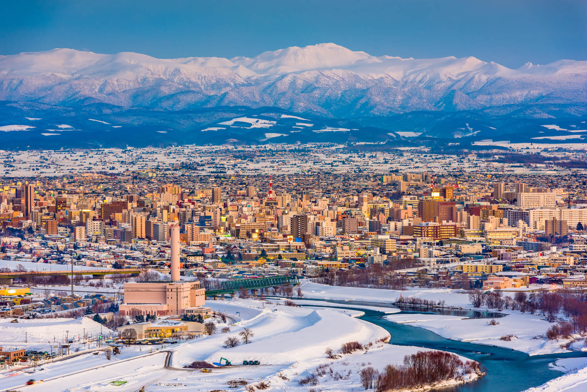
Asahikawa: The city of furniture (and 100 rivers no one cares about)
I don’t mean to tease my neighbors; I’m just grateful for my own city’s branding. Asahikawa is known as the “City of Furniture.” This actually makes sense. We have the hardwood forests, the sawmills, and generations of craftsmen. Even manufacturers from outside Hokkaido come here just to buy our wood.
To be honest, Asahikawa is also officially called “The City of Rivers” because we have over 100 of them. But let’s be real: who is actually attracted to a city just because it has rivers? “City of Furniture” suggests craft and quality. “City of Rivers” just suggests you might get your feet wet.
I confess that I have a soft spot for the desperate taglines of Hokkaido—because they remind me how hard it is to build a true identity. At CondeHouse, we don’t hide behind vague clichés like ‘the town of flowers’ or ‘the place with rivers.’ We represent the ‘City of Furniture,’ a title earned through generations of sawdust and stubborn craftsmanship. Our Hatsune Miku Art Chair is the ultimate proof of this identity. It’s not a ‘loose’ mascot or a leap of logic; it is a masterpiece of Hokkaido hardwood, crafted in a city that knows exactly what it stands for. It’s a bold, turquoise-green declaration that craft matters. Now, here is a portal to an identity that isn’t just a tagline: the image below is your link to the special site. If you prefer the forgettable, ‘polite’ branding of the status quo, do NOT click it. But if you’re ready to own a piece of a city that truly knows its craft, go ahead. Claim the real thing. —— The Hatsune Miku Art Chair.

Shungo Ijima
Global Connector | Reformed Bureaucrat | Professional Over-Thinker
After years of navigating the rigid hallways of Japan’s Ministry of Finance and surviving an MBA, he made a life-changing realization: spreadsheets are soulless, and wood has much better stories to tell.
Currently an Executive at CondeHouse, he travels the world decoding the “hidden DNA” of Japanese culture—though, in his travels, he’s becoming increasingly more skilled at decoding how to find the cheapest hotels than actual cultural mysteries.
He has a peculiar talent for finding deep philosophical meaning in things most people ignore as meaningless (and to be fair, they are often actually meaningless). He doesn’t just sell furniture; he’s on a mission to explain Japan to the world, one intellectually over-analyzed observation at a time. He writes for the curious, the skeptical, and anyone who suspects that a chair might actually be a manifesto in disguise.
Follow his journey as he bridges the gap between high-finance logic and the chaotic art of living!